
 Pregledaj u prostoru
 Pošalji
 Podeli
 Detalji o delu
 Vodič
Vodič

 Preuzmi
 Slični predmeti
 Rendgenski snimak
 Automatska prezentacija
 Pitanja i odgovori
 Statistika
Composition


 Pročitaj više
Umetničko delo prikazano na ovoj stranici zaštićeno je autorskim pravima, što znači da zakonski nismo u mogućnosti da kreiramo niti prodajemo identičnu reprodukciju. Ova zaštita se sprovodi u skladu sa međunarodnim sporazumima kao što su Bernska konvencija i nacionalnim zakonima, uključujući i one koji su definisani u Američki zakon o autorskom pravu – Naslov 17.
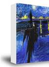
Ovaj metod je u potpunosti usklađen sa regulativama o autorskim pravima jer ne podrazumeva kopiranje ili dupliranje zaštićenih umetničkih dela. Umesto toga, reč je o kreativnoj reinterpretaciji – novom slikarskom delu koje je inspirisano originalom, ali nije identično njemu.
Giclee štampa / Umetnički otisak
Giclée štampa ili print na platnu muzejskog kvaliteta uz brzu izradu i raznovrsne opcije završne obrade. ( Kupite ručno oslikano delo Pređi na digitalnu sliku)
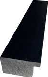
P118B дин10
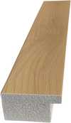
P118H дин10
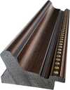
P118W дин10
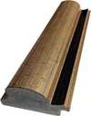
P438Z дин10
P508JH дин12
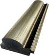
P508YH дин12
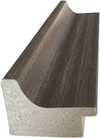
P805H дин10
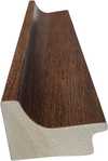
P805Z дин10
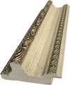
P919BZ дин10
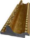
P919G дин10
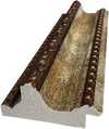
P919XJ дин10
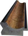
P959ZH дин10
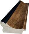
P968JZ дин12
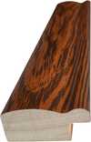
W106C дин8
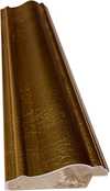
W218G дин10
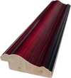
W218JH дин8
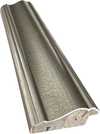
W218Y дин10
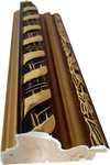
W307PJ дин10
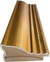
W316G дин10
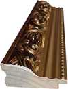
W316PJ дин8
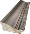
W316Y дин10
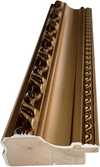
W398PJ дин8
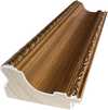
W4111J дин10
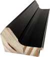
W500HY дин15
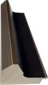
W500JH дин15
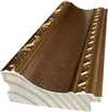
W692G дин12
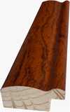
W849H дин8
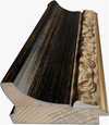
W940BG дин15
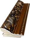
W953PJ дин8
Izaberite jednu od naših unapred definisanih veličina koje odgovaraju originalnim proporcijama umetničkog dela.

Unesite željenu širinu i visinu kako bi se štampa uklopila u vaš ram ili zid. Štampu je moguće samo iseći, ali nikada povećati iznad dimenzija originalne slike, stoga format sa drugačijim proporcijama uzrokuje gubitak dela slike. Pre početka štampe, poslaćemo vam digitalni prikaz radi potvrde. Slika prikazana na ovoj stranici ne predstavlja stvarni isrez — to pokazuje samo digitalni prikaz.
Dostava širom sveta () za 2 nedelje umesto uobičajenih 4/5 nedelja. (14 новембар)

Besplatna ekspresna dostava širom sveta

Visokokvalitetno laneno platno

Potpuno osiguranje transporta

Garancija povraćaja carine i uvoznih dažbina

Garancija vernosti boja

Politika povraćaja u roku od 100 dana (samo u slučaju nedostataka)

Garancija povrata 100% novca

Popust na više proizvoda
 Opcija sa staklom dostupna je samo za dimenzije manje od 110 cm

Composition
Giclee štampa / Umetnički otisak
Dimenzije reprodukcije
-


Ukupna cena
дин 6486
Composition by Roy Lichtenstein: A Bold Echo of Pop Art’s Aesthetic
The artwork, titled “Composition,” stands as a striking testament to Roy Lichtenstein's mastery of Pop Art—a movement that irrevocably redefined artistic boundaries in the mid-20th century. More than just a depiction of sheet music, it’s an exploration of visual language itself, mirroring Lichtenstein’s fascination with comic book aesthetics and his deliberate critique of consumer culture. The piece immediately captivates with its assertive color palette dominated by blues—a hue frequently associated with tranquility yet paradoxically juxtaposed against the energetic dynamism conveyed through its geometric arrangement.- Subject Matter: Lichtenstein’s focus isn't on capturing a literal representation of music; rather, he transforms musical notation into an abstract pattern. The staff lines and notes serve as conduits for exploring compositional principles and visual impact.
- Style & Technique: Rooted firmly in Pop Art, “Composition” embodies Lichtenstein’s signature approach—the appropriation of familiar imagery from popular culture combined with techniques reminiscent of commercial printing processes. Notably absent are Ben-Day dots, but the overall flatness and graphic quality of the artwork directly reflect Lichtenstein's inspiration from comic books.
- Color Palette: The restrained yet impactful color scheme utilizes blues, blacks, whites, yellows, reds, and browns in flat planes—a deliberate departure from traditional painting methods that prioritizes tonal variation. This simplification enhances the visual clarity and reinforces the artwork’s connection to mass media.
Compositional Dynamics: Lines and Shapes as Narrative Devices
The artwork's composition is meticulously crafted, prioritizing geometric shapes—rectangles, circles representing musical notes, and curving lines—to create a dynamic visual experience. Thick black lines delineate the staff lines and outline forms, establishing an underlying structure that contrasts with the apparent randomness of note placement. These lines aren’t merely functional; they contribute to the artwork's rhythm and convey a sense of controlled movement, mirroring the musical score itself. The strategic use of overlapping shapes adds depth without resorting to conventional perspective—a stylistic choice consistent with Lichtenstein’s rejection of academic conventions.Symbolic Resonance: Beyond Representation – A Commentary on Culture
“Composition” transcends mere visual representation; it operates as a subtle commentary on societal values and the pervasive influence of mass media. Like many Pop Art pieces, Lichtenstein utilizes simplified forms to distill complex ideas into accessible imagery—a technique that speaks to the movement’s core ethos. The bold colors and graphic style invite contemplation about how art engages with popular culture and challenges viewers to reconsider notions of beauty and artistic expression. Ultimately, it's a piece that encourages us to appreciate the power of visual language to communicate emotion and provoke thought.Historical Context: Lichtenstein’s Engagement With Modern Art
Roy Lichtenstein emerged as a pivotal voice within Pop Art during the 1960s—a reaction against Abstract Expressionism's emotional intensity and formal experimentation. He deliberately distanced himself from artistic traditions, embracing techniques borrowed from commercial printing to create artworks that were both visually arresting and intellectually stimulating. “Composition” exemplifies this commitment to innovation and serves as a compelling reminder of Lichtenstein’s enduring legacy as one of the most influential artists of his generation.Pitanja i odgovori
Da li je delo "Composition" autora Рој Ликтенстајн u javnom vlasništvu i zašto?
Status autorskih prava za delo "Composition" - i dalje je zaštićeno autorskim pravima - proizilazi iz godine smrti umetnika, 1997.
Kako "Composition" balansira svetlo i tamno?
„Composition“ ima ukupnu osvetljenost od brilliant, dok je luminansa Luminous.
Preporučena veličina štampe za delo "Composition" je?
Preporučena veličina štampe za rad "Composition" je Large. Dostupne su i druge veličine istih proporcija.
Srodna umetnička dela


Povezani članci

Beyond the Lines: Mastering the High-Impact World of Contemporary Abstraction
Master the high-impact world of contemporary abstraction. Discover how bold colors, textures, and modern movements like Abstract Expressionism can transform your space with premium, high-energy art curated for the design-conscious professional.

Mastering Abstraction: The Top 25 Essential Artworks by Wassily Kandinsky
Explore 25 iconic Wassily Kandinsky masterpieces. From Blue Rider to pure abstraction, discover the full collection on WikiOO.org.

Pop Power: The High-Impact Color Theory of Roy Lichtenstein | A Visual Journey into Pop Art Mastery
Dive into the high-impact world of Roy Lichtenstein. Explore how his bold color theory, Ben-Day dots, and comic book aesthetics revolutionized modern art and continue to define contemporary visual culture.

Pop Art: 10 Remek Dela Koja Su Definisala Pokret – I Uredila Vaš Dom
Otkrijte 10 remek dela koja su definisala pop art pokret! Istražite Andy Warhol, Roy Lichtenstein i druge legende. Saznajte priče iza ikoničnih slika i inspirisanje za vaš dom. Kvalitetne reprodukcije na WikiOO.org – ispunite svoj prostor umetnošću!

Najbolja dela Roja Lichtenštajna: Pop art ikone za vaš dom | WikiOO
Istražite 25 najpoznatijih dela Roja Lichtenštajna! Otkrijte priče iza pop art ikona, bend-dots tehniku i živopisne boje. Reprodukcije slika vrhunskog kvaliteta za vaš dom na WikiOO.org.


