


 Переглянути в інтер'єрі
 Надіслати як листівку
 Поділитися
 Деталі витвору
 Посібник

 Завантажити
 Схожі екземпляри
 Рентгенівське дослідження
 Слайд-шоу
 Q&A
Q&A Статистика
Look closer
Every detail, painted by hand
No.18 by Mark Rothko – A striking color field painting featuring layered hues of red, white, and orange, created in 1951 amidst the backdrop of Latvian Jewish heritage.
i.
The heart of the scene.
ii.
Light and background.
iii.
The brushwork.
The painting
A Symphony of Saturated Silence
Mark Rothko’s No.18 stands as a profound testament to the enduring power of color field painting, a movement that fundamentally revolutionized artistic expression in the mid-20th century. Created in 1951, this monumental canvas embodies Rothko's signature approach: the deliberate layering of saturated hues onto a textured surface to evoke a deep, visceral emotional resonance. To gaze upon No.18 is to enter a space where the boundaries between the viewer and the canvas begin to dissolve. The painting eschews traditional representational imagery, opting instead for amorphous, bleeding rectangles of crimson red and luminous white that seem to pulse with a life of their own. This technique was never merely about visual aesthetics; it was a conscious effort by Rothko to bypass intellectual analysis and tap directly into the subconscious mind, inviting a sensory engagement that transcends the spoken word.
The technical mastery behind this piece lies in its subtle, tactile complexity. Through the application of multiple coats of oil paint, Rothko achieved a surface depth that invites the eye to wander through layers of light and shadow. The composition is dominated by a striking contrast: a powerful red area commands the left side of the frame, bleeding softly into a vast expanse of white that covers much of the right. A sudden, unexpected flicker of orange in the top right corner provides a momentary spark of warmth, breaking the tension between the primary tones. This interplay of color and texture creates a breathing, living organism of paint, making it an extraordinary centerpiece for any collection or a sophisticated focal point in a thoughtfully curated interior.
Echoes of History and Spiritual Yearning
To understand the gravity of No.18, one must look toward the historical landscape from which it emerged. The painting was birthed in the aftermath of World War II, an era defined by widespread disillusionment and a global sense of existential questioning. Rothko himself carried a profound personal history of loss—most notably the death of his father in 1937—which fueled his lifelong preoccupation with themes of mortality and spiritual yearning. These themes, deeply rooted in Jewish mysticism, find their way into the very fabric of the canvas. The painting serves as a bridge between the trauma of the post-war world and a search for transcendence.
The symbolism within the work is both universal and deeply personal. The choice of red and white is far from arbitrary; it reflects Rothko's belief in the primal language of color. Red symbolizes passion, vitality, and the raw energy of human existence, while the expansive white represents purity, light, and spiritual illumination. Together, they create a dialectic between the earthly and the divine, the heavy and the ethereal. For collectors and designers alike, No.18 offers more than just visual beauty; it offers an invitation to contemplation. It is a piece that demands presence, making it an ideal acquisition for those seeking to infuse their spaces with a sense of profound peace, intellectual depth, and timeless elegance.
Питання та відповіді
Який основний відтінок пронизує «No.18» роботи Марк Ротко?
«No.18» має відтінок, що схиляється до Amber to Saffron.
Де я можу придбати цифрове зображення «No.18» роботи Марк Ротко?
Щоб отримати цифровий файл твору «No.18» роботи Марк Ротко, замовте завантаження цифрового зображення високої роздільної здатності на його сторінці Цифрове зображення високої якості.
Загалом, «No.18» є більш світлою чи темною?
Загальна яскравість твору "No.18" становить brilliant, а його світловий показник — Bright Balance.
Цей твір захищено авторським правом
Мистецький твір, представлений на цій сторінці, захищений законом про авторське право, що унеможливлює легальне створення або продаж його ідентичної репродукції. Цей захист забезпечується відповідно до міжнародних угод, таких як Бернська конвенція та національним законодавством, зокрема положеннями, що викладені в Законодавство США про авторське право — Розділ 17. Всі права захищені. Будь-яке використання без дозволу заборонено.
Як шанобливу та законну альтернативу, ми пропонуємо унікальні картини ручної роботи, створені натхненням від оригіналу. Наші досвідчені професійні художники ретельно вивчають стиль, настрій та художню сутність оригіналу, щоб створити новий, неповторний твір, який викликає ті ж почуття, — залишаючись при цьому самобутнім творінням.
Цей метод повністю відповідає нормам авторського права, оскільки він не передбачає копіювання чи дублювання захищеного твору мистецтва. Натомість це творче переосмислення — створення нового малюнка під впливом оригіналу, який не є його точним відтворенням.
 Читати далі
Марк Ротко
1903 - 1970, Латвія
The painter
Пориньте у світ емоційного кольору! Картина Марка Рота з 1952 року – шедевр абстрактного експресіонізму, що запрошує до роздумів та спокусив світ мистецтва.
Біографія митця
Early Life and the Seeds of Artistic Vision
Mark Rothko, born Markus Yakovlevich Rothkowitz in Dvinsk, Latvia, in 1903, carried within him from the outset a sense of displacement that would profoundly shape his artistic journey. His early years were marked by the anxieties of a Jewish family living within the Pale of Settlement, shadowed by pogroms and political unrest. This atmosphere instilled a deep sensitivity to human suffering, a theme that would resonate throughout his oeuvre. The 1913 immigration to Portland, Oregon, represented not just a geographical shift but a cultural upheaval for the young Rothko. While his father, a pharmacist and intellectual with socialist leanings, fostered a home filled with debate and learning, the loss of Jacob Rothkowitz shortly after their arrival cast a long shadow. This early experience of loss, coupled with the challenges of assimilation, fueled a lifelong exploration of existential themes – mortality, trauma, and the search for meaning in a chaotic world. Though he excelled academically at Yale University, Rothko found himself drawn more to the vibrant energy of New York City, abandoning formal studies to pursue his passion for art at the Art Students League. These formative years laid the groundwork for an artistic vision that would ultimately challenge conventional notions of painting and redefine the emotional power of color.From Figurative Beginnings to Abstract Expressionism
Rothko’s initial artistic explorations were firmly rooted in realism, depicting urban scenes and portraits with a keen eye for detail. However, these early works already hinted at the psychological depth that would become his hallmark. As the 1940s unfolded, and the world grappled with the horrors of World War II, Rothko’s art underwent a dramatic transformation. Influenced by Surrealism and mythology, he began to move away from representational imagery, seeking instead to express universal human emotions through symbolic forms. This period saw the emergence of multi-form paintings – canvases populated by ambiguous, biomorphic shapes that seemed to hover between figuration and abstraction. These works were not merely experiments in form; they were deeply felt responses to the anxieties and uncertainties of a world at war. By the late 1940s, Rothko had arrived at his signature style: large-scale canvases featuring rectangular blocks of color that appeared to float and resonate with one another. He stripped away all vestiges of recognizable imagery, focusing instead on the pure emotional impact of color and form. This marked a pivotal moment in the development of Abstract Expressionism, and established Rothko as a leading figure in this groundbreaking movement.The Color Field and the Pursuit of Transcendence
Rothko’s mature work is defined by what came to be known as “Color Field” painting – vast expanses of luminous color that envelop the viewer in an immersive experience. These paintings are not about *what* they depict, but rather *how* they make you feel. Rothko believed that art should engage the viewer viscerally, bypassing intellectual analysis and speaking directly to the emotions. He meticulously layered thin washes of paint, creating subtle variations in tone and texture that seemed to emanate from within the canvas. The edges of his rectangular forms are often blurred, allowing them to blend and interact with one another, creating a sense of depth and movement. Rothko deliberately avoided titles beyond numbers – “No. 1,” “No. 6” – encouraging viewers to confront the paintings without preconceived notions and allow their own emotional responses to guide their experience. He sought to create a space for contemplation, a sanctuary where viewers could connect with something larger than themselves. His ambition was nothing less than to evoke profound spiritual experiences through the language of color.Major Achievements and Lasting Legacy
Among Rothko’s most significant achievements are “No. 10 (1950),” a pivotal work that exemplifies his evolving style, and the Seagram Murals (1958). Commissioned for the Four Seasons Restaurant in New York City, these murals were ultimately rejected by Rothko, who felt they would be compromised by their intended environment. He instead donated them to the Tate Gallery in London, where they continue to inspire awe and contemplation. Perhaps his most ambitious project was the Rothko Chapel (1971) in Houston, Texas – a non-denominational sanctuary housing fourteen of his paintings. Designed as a space for quiet reflection, the chapel is considered a sacred place by many, embodying Rothko’s belief in the spiritual power of art. Rothko's influence on subsequent generations of artists has been immense. He paved the way for Minimalist art and continues to inspire contemporary painters who explore the emotional possibilities of abstraction. Despite struggling with depression throughout his life, culminating in his tragic suicide in 1970, Mark Rothko remains one of the most important and influential artists of the 20th century – a master of color whose work continues to resonate with audiences around the world.- Rothko’s paintings are celebrated for their ability to convey universal human emotions—tragedy, ecstasy, despair, and hope.
- His exploration of color as a vehicle for emotional expression revolutionized abstract painting.
- The Rothko Chapel stands as a testament to his belief in the spiritual power of art.
- He remains a pivotal figure in Abstract Expressionism and a major influence on contemporary artists.
Quick facts about Марк Ротко
- Artistic Movement Or Style: Поле кольору
- Artists Or Movements Influenced By This Artist: ['Мінімалізм']
- Date Of Birth: 25 вересня 1903 р.
- Date Of Death: 25 лютого 1970 р.
- Full Name: Маркус Якововвич Ротако́вський
- Nationality: Американський
- Notable Artworks:
- №10 (1950)
- Мюрали Се́грамм
- Хаппель Ро́тка
- Place Of Birth: Девґавпільс, Латвія


Олійная репродукція ручної роботи
Have it painted for you
Олійная репродукція ручної роботи
Написана вручну олією на полотні у вашому розмірі та рамі, виготовлена на замовлення нашими художниками. ( Перейти до друку Перейти до цифрових зображень)

Your commission

No.18
Матеріал репродукції
Розмір репродукції
-

Видатний майстер-художник
Більше деталізації, витонченості та додаткового часу на створення твору
-

Рама для репродукції
-
-
Для творів мистецтва або репродукцій, розмір яких перевищує 105 см (приблизно 41 дюйм) з будь-якого боку, рама доставляється у вигляді розібраного комплекту. Такий метод гарантує безпечну доставку та запобігає пошкодженням під час транспортування.
Потребує професійного збирання — це не продукт для самостійного виготовлення (DIY).
Комплект має бути зібраний, а полотно натягнуте досвідченим майстром багетних робіт із використанням клейового дерева (не входить у комплект), щипців для натягування полотна та затискачів, щоб підрамник залишався рівним під час висихання клею. Неправильне збирання або нерівномірне натягування полотна може призвести до незворотного пошкодження твору мистецтва, що не підпадає під дію нашої гарантії.
 Для творів мистецтва або репродукцій, розмір яких перевищує 105 см (приблизно 41 дюйм) з будь-якого боку, рама доставляється у вигляді розібраного комплекту. Такий метод гарантує безпечну доставку та запобігає пошкодженням під час транспортування.
У комплект входять усі бруски з цільного дерева, точно вирізані за розміром.
Збирається за допомогою гвинтів, що входять до комплекту, а також клейового розчину для кутових з'єднань, який не входить до комплекту і має бути підготовлений вашим майстром.
Потрібні професійні інструменти, які не входять до комплекту: щипці для натягування полотна (натягувач) та затискачі, щоб утримувати рейки рівно під час висихання клею.
Важливо:
Для з'єднання кутів потрібен клей для дерева, перекладини необхідно затиснути струбцинами до повного висихання клею, а для натягування полотна на зібрану раму знадобляться щипці для натягування полотна. Жоден із цих інструментів не входить до комплекту. Будь ласка, проконсультуйтеся з досвідченим майстром багетного оформлення перед замовленням рами такого розміру.

Етикетка експоната
-
-

Захисний лак
Глянцевий лак (підсилює яскравість кольорів, захищає від світла та вологи)
-

Персоналізувати мій витвір
Приклади можливих змін: заміна обличчя на фото клієнта; додавання домашньої тварини (наприклад, заміна кота на собаку); додавання прихованого повідомлення на фоні; зміна пейзажу або елементів фону.
-

Прискорено
Доставка по всьому світу () за 3–4 тижні замість стандартних 5 тижнів. (31 Жовтень). Без компромісів у якості.
-
Експрес-доставка
Доставка по всьому світу () протягом 5 тижнів. (7 Листопад).
Включено в ціну
Підсумкова вартість
₴ 11913
Скляний варіант доступний лише для розмірів до 110 см
i.
Scale
Slide to your wall: every size keeps the proportions of the original.
Обирайте з наших стандартних розмірів, що відповідають оригінальним пропорціям твору мистецтва.

Введіть необхідну ширину та висоту, щоб картина підійшла до вашої рами або стіни. Оскільки це ручний розпис, для зміни пропорцій художник може дописати трохи більше по краях або дещо обрізати композицію — вибір за вами. Перед початком роботи ми надішлемо вам цифровий макет для затвердження. Зображення, показане на цій сторінці, не є реальним результатом — лише макет відображає майбутній вигляд.
ii.
Frame
The frame is drawn on the painting at its true width.
У рамі
White ₴1
Blurside ₴1
Extended ₴1
P118B ₴10
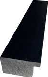
P118H ₴10
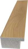
P118W ₴10
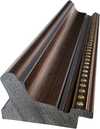
P438Z ₴10
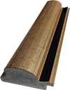
P508JH ₴12
P508YH ₴12
P805H ₴10
P805Z ₴10
P919BZ ₴10
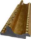
P919G ₴10
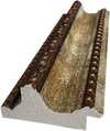
P919XJ ₴10
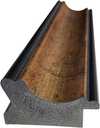
P959ZH ₴10
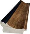
P968JZ ₴12
W106C ₴8

W218G ₴10
W218JH ₴8
W218Y ₴10
W307PJ ₴10

W316G ₴10
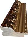
W316PJ ₴8
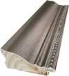
W316Y ₴10
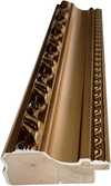
W398PJ ₴8
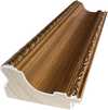
W4111J ₴10
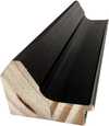
W500HY ₴15
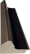
W500JH ₴15
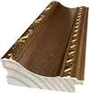
W692G ₴12
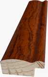
W849H ₴8
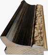
W940BG ₴15
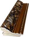
W953PJ ₴8

H24-GOLD ₴30
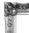
H24-SILVER ₴30
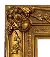
H36-GOLD ₴45
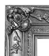
H36-SILVER ₴45
iii.
Make it yours
A painting made by hand can be made for one person.
After order, WikiOO.org team will email client for instructions and provide a mockup preview
iv.
Finishing
Nameplate, varnish and delivery.
Етикетка експоната
Деталі гравірування на бронзовій табличці
This elegant plaque features the artist's name and the title of the artwork, finely engraved for a timeless presentation.
It is made from bronze with a refined, elegant finish. The text is precisely laser-engraved for a sharp and permanent result. Measuring 9x2 cm, the plaque is compact yet easy to read. It's built to be durable and scratch-resistant, offering a professional, museum-quality look. Mounting is simple thanks to the included adhesive backing.
Деталі прозорої акрилової таблички
The plaque includes essential engraved details such as the artist's name, the title of the artwork, the date it was created, the type of media used-like oil on canvas or watercolor-a brief description of the piece, and a QR code that links to the complete artwork information.
It is crafted from clear acrylic, offering a sleek, modern appearance. The text is UV-engraved in black to ensure strong visual contrast. With a size of 10x15 cm, it ensures optimal readability. It comes equipped with two metal hooks for secure wall mounting. The plaque is designed to be weather-resistant, making it suitable for various environments, and it includes interactive features that work seamlessly with smartphone scanning.
Деталі чорної акрилової таблички
This elegant plaque includes engraved information such as the artist's name, the title of the artwork, the date it was created, the type of media used (like oil on canvas or watercolor), a short description of the artwork, and a QR code for quick access to more information.
The plaque itself is made from refined black acrylic with a premium finish. The text is laser-engraved in white for high contrast and readability. Its size is 10x15 cm, designed to be easy to read. It comes with two metal hooks for professional mounting. The design is sleek and fits any interior style. It is also weather-resistant and durable, with built-in digital integration for mobile compatibility.
Захисний лак
Прискорене виготовлення
Доставка по всьому світу () за 3–4 тижні замість стандартних 5 тижнів. (31 Жовтень). Без жодних компромісів у якості.
- Безкоштовна експрес-доставка по всьому світу
- Високоякісне лляне полотно
- Повне страхове покриття доставки
- Гарантія повернення митних зборів
- Гарантія точного відтворення кольорів
- Політика повернення протягом 100 днів (лише у разі виявлення дефектів)
- Гарантія повернення 100% коштів
- Пропозиція на оптові замовлення


Quick facts and art quiz
Пов'язані статті

Color Field Painting: The Emotional Power of Pure Abstraction and Chromatic Depth
Explore the profound emotional depth of Color Field painting. Discover the history of mid-century abstraction, from Rothko to Newman, and learn how pure color transforms the viewer's experience through our expert art history guide.

Топ-10 шедеврів абстрактного експресіонізму: мистецтво, яке змінила епоху | WikiOO.org
Відкрийте для себе 10 шедеврів абстрактного експресіонізму! Дізнайтесь історію Поллока, Ротко та інших геніїв. Репродукції картин преміум-якості для вашого дому від WikiOO.org. Дослідіть колекцію онлайн!

Топ-25 шедеврів Василя Кандинського: подорож у світ абстрактного мистецтва | WikiOO.org
Відкрийте для себе 25 найвідоміших шедеврів Василя Кандинського! Пориньте у світ абстрактного мистецтва, експресіонізму та кольорових композицій. Репродукції картин Кандинського преміум-якості на WikiOO.org – для вашого інтер'єру з душею. Дослідіть повну колекцію онлайн!

Топ-10 шедеврів у білих тонах: мистецтво світла та простору від WikiOO
Відкрийте для себе 10 легендарних картин, де білий колір стає головним героєм! Історія Моне, Ван Гога та інших майстрів. Купіть репродукції шедеврів імпресіонізму на WikiOO.org – мистецтво для вашого дому.


