


 Preview
 Send
Send Share
Share
 Details
 Guide
Guide

 Download
 Similars
 X-Ray
X-Ray Diaporama
 Q&A
Q&A Stats
StatsLook closer
Every detail, painted by hand
Three spots of the painting, enlarged. Our artists reproduce each of them by hand, at the size you choose.
i.
The heart of the scene.
ii.
Light and background.
iii.
The brushwork.
The painting
Collectible Description
 Read More
Artist Biography
A pioneer of Pop Art known for his iconic Flag paintings. Explore the symbolic world of Jasper Johns today.
A Bold Exploration of Language and Form: Jasper Johns’ Gray Alphabets
Jasper Johns' "Gray Alphabets," created in 1956, stands as a cornerstone of American Pop Art and a fascinating testament to the artist’s innovative approach to visual representation. More than just a collection of letters arranged on paper—though undeniably striking in its simplicity—the painting embodies Johns’s deliberate challenge to conventions established by Abstract Expressionism, prioritizing recognizable imagery alongside formal experimentation.
- Subject Matter: The artwork centers around the alphabet itself – uppercase and lowercase letters meticulously positioned within a grid structure. This selection of familiar symbols reflects Johns' fascination with everyday objects and their ability to convey profound meaning beyond their literal form.
- Style & Technique: Executed in beeswax and oil on newspaper and paper on canvas, “Gray Alphabets” exemplifies Johns’s signature technique—a blend of encaustic painting (beeswax mixed with pigment) and collage. The subtle shading achieved through encaustic lends a tactile quality to the surface, enhancing the visual impact of the printed letters.
- Historical Context: Emerging in the wake of Abstract Expressionism's dominance, Pop Art sought to liberate art from emotional intensity, focusing instead on popular culture and accessible imagery. Johns’s decision to utilize the alphabet—a symbol of knowledge and communication—directly confronted the expressive concerns of its predecessors.
Decoding Ambiguity: Symbolism Within Geometric Precision
The gray color palette is crucial to understanding “Gray Alphabets.” Often associated with neutrality, balance, and even ambiguity, it serves as a counterpoint to the vibrant hues typically employed in Abstract Expressionist canvases. Johns deliberately avoids overt emotional expression, inviting viewers to engage in an intellectual process of decipherment—to consider what the arrangement of letters communicates beyond its surface appearance.
- Geometric Structure: The grid format itself is significant, harking back to architectural drawings and reinforcing the idea that Johns was exploring the relationship between language and visual order. This deliberate structuring mirrors the way words are organized in sentences, creating a parallel visual experience.
- Repetition & Rhythm: Johns’s meticulous repetition of letters—each positioned sequentially within the grid—creates a rhythmic pattern that draws attention to the fundamental building blocks of communication. The subtle variations in shading contribute to this rhythm, adding depth and nuance to the overall composition.
Legacy & Influence: A Quiet Revolution
"Gray Alphabets" represents a pivotal moment in Johns’s artistic trajectory—a move away from purely abstract exploration toward incorporating recognizable elements into his work. It solidified his position as a pioneer of Pop Art and influenced subsequent generations of artists who sought to redefine the boundaries of visual art. The painting continues to resonate today, prompting viewers to contemplate the power of symbols and the beauty found in simplicity.
- Connection to Flag: Like Johns’s iconic “Flag” painting—also executed in 1956—“Gray Alphabets” demonstrates his preoccupation with American iconography. Both works utilize a repetitive motif—the flag or the alphabet—to explore themes of identity and national consciousness.
- Continuing Relevance: The artwork's enduring appeal lies in its ability to provoke contemplation about how we perceive language and imagery, reminding us that art can communicate profound ideas through seemingly unassuming forms.
Questions & Answers
What luminance does "Gray alphabets" by Jasper Johns have?
"Gray alphabets" by Jasper Johns has a bright balance luminance. Luminance describes how much light the colors appear to reflect.
Which artistic current is "Gray alphabets" by Jasper Johns part of?
"Gray alphabets" by Jasper Johns belongs to the Pop Art movement. This movement provides the stylistic context of the work.
Where does "Gray alphabets" by Jasper Johns sit in art history?
"Gray alphabets" by Jasper Johns belongs to the Pop Art movement, within the Modern period. Together they give the work its place in art history.
This Artwork Is Under Copyright Protection
The artwork displayed on this page is protected by copyright law, which means we cannot legally create or sell an identical reproduction. This protection is enforced under international agreements such as the Berne Convention and by national laws, including those outlined by the U.S. Copyright Law - Title 17.
As a respectful and legal alternative, we offer custom, hand-painted artworks inspired by the original. Our skilled and professional artists carefully study the original's style, mood, and artistic essence to create a new, unique piece that evokes the same feeling - while remaining an original creation in its own right.
This method fully complies with copyright regulations because it does not involve copying or duplicating the protected artwork. Instead, it is a creative reinterpretation - a new painting that is influenced by the original but not identical to it.

Jasper Johns
1930 - , United States of America
The painter
Artist Biography
Early Life, Family and Training
Jasper Johns was born on May 15, 1930, in Augusta, Georgia. His parents' marriage ended in divorce when he was very young, leading him to be raised in South Carolina. He spent much of his childhood in Allendale, South Carolina, living with his paternal grandparents. Later, he spent time with his mother and stepfather in Columbia, and eventually lived with his Aunt Gladys on Lake Murray. He began drawing at the age of three. By the time he reached high school, he was already focused on his craft, eventually graduating as the valedictorian of the class of 1947 from Edmunds High School in Sumter, South Carolina.
His formal training began in the South. He attended the University of South Carolina at Columbia for three semesters. After leaving the university, he moved to New York City in 1949. There, he enrolled at the Parsons School of Design to continue his studies. He worked various odd jobs during these formative years, including a stint as a bookstore clerk, before his path was interrupted by the draft.
Military Service and Return to New York
The trajectory of his early years was interrupted in 1951 when he was drafted into the United States Army during the Korean War. This period of service took him away from the art schools of the East Coast and placed him in two very different settings. He spent time stationed at Fort Jackson in South Carolina before being sent to Sendai, Japan. These years of military duty provided a distance from the burgeoning art scene he had begun to navigate in New York.
By the summer of 1953, he returned to New York City. The city was a place of transition, and he found work at Marboro Books. This period of employment allowed him to settle back into the urban environment, moving through the city's social and artistic layers. It was during these post-service months that he began to form the connections that would define his later practice, working alongside others in the city's lofts and studios.
The Emergence of a New Visual Language
By 1954, a shift had occurred in the way objects were handled on the canvas. Instead of the spontaneous, gestural marks that defined the era, there was a move toward things the mind already knows. This meant using symbols that required no explanation: flags, maps, targets, letters, and numbers. These were not illustrations of specific events, but rather recognizable forms used to explore how we perceive meaning. The work became a way to look at the act of seeing itself, using the familiar to question the nature of representation.
This approach helped establish him as a central figure in the development of American postwar art. His first solo exhibition took place in 1958 at the Leo Castelli Gallery, where the presence of these common symbols first met a wider audience. The paintings did not try to escape the world through abstraction; they brought the world into the studio through these quiet, repetitive motifs. By stripping away the need for narrative, the focus shifted to the surface and the way a symbol functions as a visual code.
Technique and Artistic Style
The surface of a Johns painting often feels heavy and built up. He frequently used encaustic, a process where pigment is mixed with hot wax to create a thick, textured layer. This method allows for a physical depth that sits on the canvas, sometimes incorporating collage and newsprint directly into the wax. These layers do not suggest a quick, spontaneous gesture. Instead, the work shows a sense of conscious control. Every mark and shape seems placed with a specific intent, moving away from the messy, emotional drips seen in other mid-century styles. He preferred a more calculated approach to how an image is constructed.
Beyond the canvas, his hand shows in many different ways. He moved between the heavy texture of encaustic and the precise, sharp lines of printmaking. His practice included lithography, screenprint, etching, and aquatint. These methods allowed him to repeat certain shapes and symbols with varied textures. He often used the same motifs—numbers, letters, or maps—to see how they changed when the method of application shifted. The work is about the way a viewer recognizes a shape and how that recognition changes when the surface is layered or fragmented.
- Target (1958)
- White Flag (1955)
- Colored alphabet (about 1959)
- False Start (1959)
- Perilous Night (1982)
Key Works and Iconic Imagery
The work often centers on things the mind already knows. In the mid-1950s, the painting Flag (1954–55) used a collage of the Stars and Stripes, layering newspaper with pigment. This approach turned a familiar symbol into a textured surface of wax and paper. The imagery moved from these large, flat symbols toward more concentrated forms. The target series followed, using the bullseye to question how a viewer perceives a simple shape. One such piece, Target with Four Faces (1958), placed faces within the red field, creating a sense of unease through their repetitive, expressionless arrangement.
The focus on recognizable objects continued into the 1960s. The 1961 work Map used fragmented depictions of the United States to look at geography and identity. This period also saw a shift toward three-dimensional forms that mimicked everyday items. In 1960, the Painted Bronze (Beer Cans) series was produced. These sculptures were cast in bronze but painted to look exactly like the common objects they represented, blurring the line between a real object and a painted one.
- White Flag (1955)
- Three Flags (1958)
- False Start (1959)
- Colored Alphabet (about 1959)
Circle of Influential Associates
In the lofts of Manhattan, the air was thick with shared ideas and the quiet friction of proximity. Johns lived in adjacent apartments to Robert Rauschenberg, a relationship that was both romantic and artistic until 1961. They spent their days designing window displays for stores like Tiffany and Bonwit Teller, working side by side to transform the mundane into something else entirely. This closeness meant their work was constantly in conversation, a continuous exchange of thoughts and visual experiments that helped define a new direction for American art.
The circle extended into the realms of sound and movement. Johns was close friends with the composer John Cage and the choreographer Merce Cunningham. These connections brought a different kind of rhythm to his thinking, one rooted in the avant-garde. He moved through a landscape where the boundaries between different disciplines were porous, influenced by the way Cage and Cunningham approached structure and chance. Even the ideas of Marcel Duchamp lingered in the background, providing a framework for questioning the very nature of what an object could represent when placed within a frame.
Legacy and Enduring Influence
The shift from the spontaneous, gestural marks of Abstract Expressionism toward the recognizable imagery of Pop Art happened in large part through his hands. By taking things the mind already knows—flags, targets, and numbers—and treating them as subjects for investigation, he changed how artists approached the canvas. This movement toward the everyday paved the way for the work of Andy Warhol and Roy Lichtenstein, who would later build upon these ideas of mass culture and commodity.
His presence in the art world has been marked by significant recognition. He was awarded the Golden Lion at the Venice Biennale in 1988. Later, in 2011, he received the Presidential Medal of Freedom. These honors reflect a career spent questioning the nature of representation and the way symbols function in a changing society.
- Flag (1954–55)
- Target (1958)
- Map (1961)
- Perilous Night (1982)
Where to See the Works Today
To see his paintings and sculptures in person, one might travel to New York City. The Museum of Modern Art holds several of his pieces, while the Whitney Museum of American Art and the Metropolitan Museum of Art also keep his work in their collections. These institutions house various stages of his development, from his early experiments with encaustic to his later explorations of the artist's studio.
His presence extends beyond the United States. In London, the Tate Modern holds works that reflect his long-standing interest in how we perceive familiar symbols. Seeing these objects in such different settings allows for a closer look at how his use of texture and repetition changes under different lights.
- White Flag, 1955
- Target, 1958
- Map, 1961
- Perilous Night, 1982
- Dancers on a Plane, about 1964
Quick facts about Jasper Johns
- Artists Or Movements Influenced By This Artist:
- Pop Art
- Andy Warhol
- Roy Lichtenstein
- Artists Who Influenced This Artist: ['Marcel Duchamp']
- Full Name: Jasper Johns
- Nationality: American
- Notable Artworks:
- Flag
- Target
- Map
- False Start
- White Flag
- Place Of Birth: Augusta, United States of America
- Date Of Birth: 1930


Hand Made Oil Reproduction
Have it painted for you
Hand Made Oil Reproduction
Hand-painted oil on canvas in your size and frame, made to order by our artists. ( Switch to Print Switch to Digital Image)

Your commission

Gray alphabets
Reproduction Medium
Reproduction Size
-

Elite Senior Artist
More detail, finesse, and extra production time
-

Reproduction Frame
-
-
For artworks or reproductions larger than 105 cm (approximately 41 inches) on any side, the frame will be shipped as a kit, disassembled. This method ensures safe delivery and prevents damage during transport.
Professional assembly required - this is not a DIY product.
The kit must be assembled and the canvas stretched by an experienced professional framer, using wood glue (not supplied), a canvas stretching plier and clamps to hold the bars square while the glue dries. Incorrect assembly or uneven canvas tension can permanently damage the artwork and is not covered by our warranty.
 For artworks or reproductions larger than 105 cm (approximately 41 inches) on any side, the frame will be shipped as a kit, disassembled. This method ensures safe delivery and prevents damage during transport.
All solid wood bars are included, precisely cut to size.
Assembled with the screws provided, plus wood glue for the corner joints, which is not supplied and must be sourced by your framer.
Professional tools are required and not included: a canvas stretching plier (tensioner) and clamps to hold the bars square while the glue dries.
Important:
The corner joints require wood glue, the bars must be held with clamps until the glue is fully dry, and tightening the canvas on the assembled frame requires a canvas stretching plier. None of these are included in the kit. Please arrange an experienced professional framer before ordering this size.

Nameplate
-
-

Protective Varnish
Glossy Varnish (enhances colors, protects against light/moisture)
-

Customize My Artwork
Examples of what can be changed: Replace face with customer photo; Add pet (e.g., replace cat with dog); Include hidden message in background; Change background landscape or elements.
-

Urgent
Worldwide Delivery () in 3/4 weeks instead of standard 5 weeks. (10 November). No compromise on quality.
-
Express Shipping
Worldwide Delivery () in 5 weeks. (17 November).
Included
Total Price
$ 265
Glass option is only available in size under 110 CM
i.
Scale
Slide to your wall: every size keeps the proportions of the original.
Pick from our preset sizes that match the artwork's original proportions.

Type the width and the height you need, to fit your frame or your wall. This is hand-painted, so for a size with a different shape the artist can paint a bit more around the picture, or cut a bit — you choose. We send you a digital mockup to approve before the painting starts. The picture shown on this page does not show the real result — only the mockup does.
ii.
Frame
The frame is drawn on the painting at its true width.
Framed
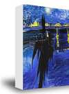
White $1
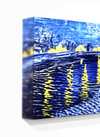
Blurside $1
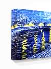
Extended $1
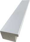
P118B $10
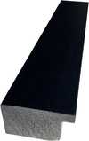
P118H $10
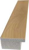
P118W $10
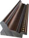
P438Z $10
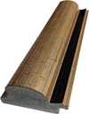
P508JH $12
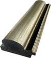
P508YH $12
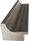
P805H $10
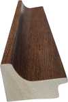
P805Z $10
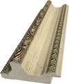
P919BZ $10
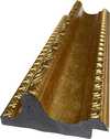
P919G $10
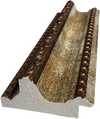
P919XJ $10
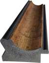
P959ZH $10
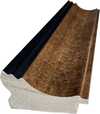
P968JZ $12
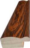
W106C $8
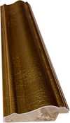
W218G $10
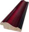
W218JH $8
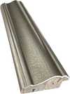
W218Y $10
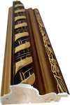
W307PJ $10
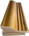
W316G $10
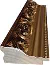
W316PJ $8
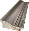
W316Y $10
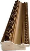
W398PJ $8
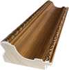
W4111J $10
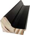
W500HY $15
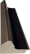
W500JH $15
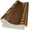
W692G $12
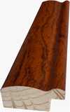
W849H $8
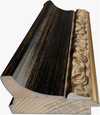
W940BG $15
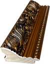
W953PJ $8
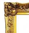
H24-GOLD $30
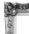
H24-SILVER $30
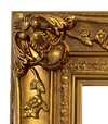
H36-GOLD $45
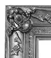
H36-SILVER $45
iii.
Make it yours
A painting made by hand can be made for one person.
iv.
Finishing
Nameplate, varnish and delivery.
Nameplate
Engraved Bronze Plaque Details
This elegant plaque features the artist's name and the title of the artwork, finely engraved for a timeless presentation.
It is made from bronze with a refined, elegant finish. The text is precisely laser-engraved for a sharp and permanent result. Measuring 9x2 cm, the plaque is compact yet easy to read. It's built to be durable and scratch-resistant, offering a professional, museum-quality look. Mounting is simple thanks to the included adhesive backing.
Transparent Acrylic Plaque Details
The plaque includes essential engraved details such as the artist's name, the title of the artwork, the date it was created, the type of media used-like oil on canvas or watercolor-a brief description of the piece, and a QR code that links to the complete artwork information.
It is crafted from clear acrylic, offering a sleek, modern appearance. The text is UV-engraved in black to ensure strong visual contrast. With a size of 10x15 cm, it ensures optimal readability. It comes equipped with two metal hooks for secure wall mounting. The plaque is designed to be weather-resistant, making it suitable for various environments, and it includes interactive features that work seamlessly with smartphone scanning.
Black Acrylic Plaque Details
This elegant plaque includes engraved information such as the artist's name, the title of the artwork, the date it was created, the type of media used (like oil on canvas or watercolor), a short description of the artwork, and a QR code for quick access to more information.
The plaque itself is made from refined black acrylic with a premium finish. The text is laser-engraved in white for high contrast and readability. Its size is 10x15 cm, designed to be easy to read. It comes with two metal hooks for professional mounting. The design is sleek and fits any interior style. It is also weather-resistant and durable, with built-in digital integration for mobile compatibility.
Protective Varnish
Urgent Production
Worldwide Delivery () in 3/4 weeks instead of standard 5 weeks. (10 November). No compromise on quality.
- Free Worldwide Express Shipping
- High-Quality Linen Canvas
- Full Shipping Insurance
- Customs Tax Refund Guarantee
- True Color Matching Guarantee
- 100-Day Return Policy (Defects Only)
- 100% Money-Back Guarantee
- Bulk Discount Offer


Quick facts and art quiz
Related Articles

Grant Wood & American Regionalism: Identity, Myth & the Rural Landscape
Explore the world of Grant Wood & American Regionalism with WikiOO. Discover the symbolism behind 'American Gothic', recurring themes, and the movement's lasting impact on art history. High-quality reproductions available.

Masterpieces of Nature: The Top 25 John Constable Artworks
Explore John Constable's iconic landscapes and Romantic masterpieces. Discover the full collection online at WikiOO.org.

John Singer Sargent's 25 Masterpieces: Portraits & Beyond | WikiOO
Explore 25 iconic John Singer Sargent paintings – from dazzling portraits to Impressionist landscapes. Discover the stories behind Madame X, El Jaleo & more! Find museum-quality art reproductions and elevate your home decor with WikiOO.org.

John George Brown: Capturing American Life & Sentiment in 19th-Century Genre Painting
Explore the captivating genre paintings of John George Brown, celebrated for his realistic depictions of 19th-century American life. Discover his legacy & find museum-quality reproductions at WikiOO.


