
 Preview
 Send
Send Share
Share
 Details
 Guide
Guide

 Download
 Similars
 X-Ray
X-Ray Diaporama
 Q&A
Q&A Stats
StatsComposition no. II

- 88.0 x 115.0 cm


 Read More
Giclée / Art Print
Museum-quality giclée or canvas print with fast production and flexible finish options. ( Buy Hand Made Painting Switch to Digital Image)
P118B $10
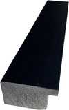
P118H $10
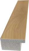
P118W $10
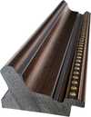
P438Z $10
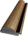
P508JH $12
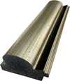
P508YH $12
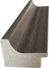
P805H $10
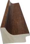
P805Z $10
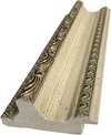
P919BZ $10
P919G $10
P919XJ $10
P959ZH $10
P968JZ $12
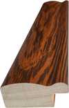
W106C $8
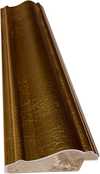
W218G $10
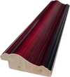
W218JH $8
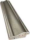
W218Y $10
W307PJ $10
W316G $10
W316PJ $8
W316Y $10
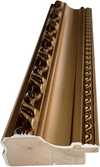
W398PJ $8
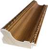
W4111J $10
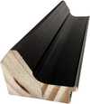
W500HY $15
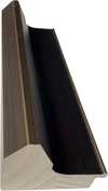
W500JH $15
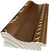
W692G $12
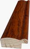
W849H $8
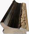
W940BG $15
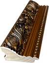
W953PJ $8

Pick from our preset sizes that match the artwork's original proportions.

Type the width and the height you need, to fit your frame or your wall. A print can only be cut, never made bigger than the picture, so a size with a different shape loses a part of the image. We send you a digital mockup to approve before we print anything. The picture shown on this page does not show the real cut — only the mockup does.
Worldwide Delivery () in 2 weeks instead of standard 4/5 weeks. (10 November)

Free Worldwide Express Shipping

High-Quality Linen Canvas

Full Shipping Insurance

Customs Tax Refund Guarantee

True Color Matching Guarantee

100-Day Return Policy (Defects Only)

100% Money-Back Guarantee

Bulk Discount Offer
 Glass option is only available in size under 110 CM

Composition no. II
Giclée / Art Print
Reproduction Size
-


Total Price
$ 62
A Dance of Lines and Light: Exploring Piet Mondrian’s *Composition no. II* (1913)
Piet Mondrian's *Composition no. II*, painted in 1913, isn’t merely a painting; it’s an architectural meditation on the very essence of reality. Emerging from his early work depicting the Dutch landscape – particularly the evocative River ’t Gein – this piece represents a pivotal shift in Mondrian’s artistic trajectory, marking his decisive move towards abstraction and the nascent principles of Neo-Plasticism. Initially rooted in the naturalistic traditions of the Hague School, Mondrian began to dismantle representation, stripping away the illusion of depth and embracing instead a rigorously constructed system of lines and colors intended to capture something far more profound: the universal harmony underlying all existence.
The canvas unfolds as a carefully orchestrated grid, dominated by rectangles and squares in varying shades of muted yellow, brown, gray, and pale pink. These aren’t arbitrary hues; Mondrian meticulously selected them from his limited palette – primary colors plus black and white – believing they possessed the purest expressive potential. The crisp, black lines that delineate each shape are not simply boundaries but active participants in the composition, creating a dynamic tension between form and space. Notice how these lines don't converge or recede; instead, they intersect and overlap, generating a sense of layered depth without resorting to traditional perspective. This deliberate flattening of space reflects Mondrian’s belief that art should transcend the limitations of the physical world and tap into a higher, more spiritual realm.
The Roots in ’t Gein: From Landscape to Abstraction
It's crucial to understand *Composition no. II*'s genesis within Mondrian’s earlier work depicting the River ’t Gein. The initial paintings of this area – particularly those capturing the farmstead nestled amongst the trees – served as a springboard for his radical transformation. He didn’t simply paint what he saw; instead, he distilled the essence of these landscapes—the lines of the riverbank, the verticality of the trees, the horizontal expanse of the water—into their most fundamental components. The reflection in the water, a key element in many of these earlier works, is here reduced to an almost ghostly suggestion, a subtle echo of its former self. This process of reduction mirrors Mondrian’s broader philosophical project: to uncover the underlying structure of reality through simplification and abstraction.
Decoding the Symbolism: Harmony Through Reduction
Mondrian himself articulated his intentions during this period with remarkable clarity: “I construct lines and colour combinations on a flat surface with the aim of depicting the general beauty as consciously as possible.” This statement encapsulates the core of Neo-Plasticism – an aesthetic philosophy rooted in the belief that art should be purely abstract, devoid of representational content. *Composition no. II* embodies this principle perfectly. The geometric forms aren’t meant to evoke specific objects or scenes; rather, they are vehicles for expressing a fundamental order and balance. The black lines act as anchors, providing stability and structure, while the colors contribute to a sense of harmony and resonance. It's a visual representation of a search for universal truth—a belief that through reducing form and color to their most essential elements, one could achieve a profound connection with the underlying order of the cosmos.
A Legacy in Form and Color
Painted in 1913, *Composition no. II* stands as a pivotal work in Mondrian’s development and a cornerstone of modern art. Its influence can be seen in countless subsequent abstract paintings and designs. The painting's enduring appeal lies not only in its formal rigor but also in its emotional resonance. It evokes a sense of calm contemplation, inviting the viewer to engage with the underlying structure of reality—a structure that Mondrian believed was accessible through the disciplined application of line and color. Today, reproductions of *Composition no. II* offer a unique opportunity to experience this profound vision firsthand, bringing a touch of timeless elegance and intellectual depth to any space.
Questions & Answers
What atmosphere would a reproduction of "Composition no. II" by Piet Mondrian bring to a room?
The minimalist atmosphere of "Composition no. II" by Piet Mondrian matches its recommended space: a living room.
What orientation does "Composition no. II" by Piet Mondrian have?
"Composition no. II" by Piet Mondrian is a landscape composition. The proportions are worth checking before choosing a print size.
What are the medium and dimensions of "Composition no. II" by Piet Mondrian?
The original "Composition no. II" by Piet Mondrian is an acrylic on canvas work measuring 88 x 115 cm. Technique and size describe the original object.
Related Artworks


Artist Biography
The Life and Identity of Piet Mondrian
The man who would reshape the visual language of the twentieth century began his life as Pieter Cornelis Mondriaan, Jr. He was born on March 7, 1872, in Amersfoort, Netherlands. For years, he operated under this formal name, but a shift occurs in 1911 when he adopts the name Piet Mondrian. He is a Dutch painter and art theoretician, a man whose intellect sought to map the very structures of existence through paint and theory.
His life moves from the quietude of the Netherlands to the frantic energy of the global stage. The final chapter of his life unfolds in New York, New York, U.S. He dies there on February 1, 1944, from pneumonia. The transition from the naturalistic landscapes of his youth to the rigid, rhythmic grids of his later years marks a total transformation of purpose.
Early Life, Family and Training
Amersfoort, Netherlands, provides the setting for his beginnings. He is born into a strict Protestant family. His father, Pieter Cornelius Mondriaan, Sr., works as a head teacher and amateur draftsman. This environment is shaped by a disciplined, religious structure. Art is present in the household through his uncle, Frits Mondriaan, a landscape painter. The boy draws from an early age, guided by these familial connections to the visual arts.
The path toward professional training is direct. By 1892, he is already qualified as a drawing teacher. He moves to Amsterdam to enroll at the Rijksakademie van Beeldende Kunsten, where he remains from 1892 to 1897. The academy provides the technical foundation for his developing vision. During this formative period, he also joins the art society Kunstliefde in Utrecht.
The Dutch Period and Impressionist Roots
The Dutch landscape provides the initial canvas. In the quietude of the Netherlands, Mondrian captures the heavy clouds and wind-swept mills of his surroundings. These early works are naturalistic, focusing on the rivers and polders that define the region. He works within the traditions of the Hague School and Dutch Impressionism, utilizing a palette that reflects the soft, muted light of the Dutch countryside. In pieces like The Red Mill, the subject remains clearly recognizable, rooted in the physical reality of the land.
A shift begins in 1908. As he engages with the theosophical movement, a search for a hidden, universal order starts to pull at his brushstrokes. He moves away from mere representation. He experiments with the structured dots of Pointillism and the bold, non-naturalistic colors of Fauvism. The focus shifts from the surface of the object to its underlying structure. By 1909, his presence in the Dutch art scene is established through a major exhibition at the Stedelijk Museum in Amsterdam.
- The Red Mill
- Evening (Avond) (1908)
The Parisian Awakening and Cubism
Paris, 1912. The city pulses with a new, aggressive energy. Mondrian arrives from the Netherlands, shedding the old Dutch spelling of his name to become Mondrian. He enters a landscape where the traditional rules of representation are being dismantled. The encounter with Cubism changes the trajectory of his work. He watches the experiments of Georges Braque and Pablo Picasso, observing how they deconstruct objects into geometric components. The focus shifts from what the eye sees to how the eye perceives structure. He begins to move away from the depiction of reality, seeking instead to analyze form through planes and lines.
This period marks a radical departure from his earlier landscapes. He is no longer interested in the soft light of the Dutch countryside. Instead, he develops an independent abstract style, stripping away the accidental to find a more fundamental visual language. The transition is not a sudden leap but a steady, disciplined reduction. He is searching for a way to express the underlying structure of existence through pure abstraction. The organic curves of his youth are replaced by the tension of intersecting planes.
- Composition in gray-blue, 1913
The Birth of Neoplasticism and De Stijl
The search for a universal truth reaches a breaking point. By 1917, the deconstruction of form has moved beyond the mere fragmentation of objects. Mondrian co-founds the De Stijl movement alongside Theo van Doesburg, seeking a visual language that transcends the accidental details of nature. He moves toward a non-representational form he terms Neoplasticism. This is a radical departure from the tangible. He argues that art should be higher than reality, existing in a realm of pure, spiritual order rather than mirroring the chaotic surface of the physical world.
The visual vocabulary becomes absolute. The artist strips away all curves and diagonals, leaving only the tension of horizontal and vertical lines. Color is no longer used to describe light or shadow on a landscape; instead, it is reduced to its most essential components. He limits his palette to the three primary colors: red, blue, and yellow. To balance these, he employs the three primary values: black, white, and gray. The result is a rigid, geometric equilibrium that seeks to manifest a hidden, structural harmony.
- 1917: Composition in colour A
- 1925: Lozenge Composition with Red, Black, Blue and Yellow
- 1930: Composition with Red, Blue and Yellow
New York and the Final Rhythm
The war forces a final movement. After a brief period in London in 1938, Mondrian arrives in New York in October 1940. The rigid, geometric order of his previous years meets the frantic, syncopated energy of Manhattan. He joins the American Abstract Artists, finding a new environment for his evolving vision. The city's pulse is everywhere. It is in the grid of the streets and the staccato rhythm of jazz music. This urban dynamism begins to break his strict adherence to solid blocks of color.
The lines begin to dance. In these final years, the heavy black bars of his earlier Neoplasticism give way to something more fragmented and rhythmic. The compositions lose their static weight, replaced by a flickering movement that mirrors the city's own electrical life. He captures the essence of the metropolis not through its buildings, but through its tempo. This shift is most evident in his late works, where the grid transforms into a series of small, pulsing squares of color.
- Broadway Boogie Woogie, about 1943
Technique and Artistic Style
The canvas becomes a site of absolute reduction. Mondrian strips away the accidental details of the physical world to reach for a structural truth. His technique relies on precise, clean lines and flat areas of color that refuse to suggest depth or texture. There is no brushwork to distract the eye, only the intersection of form and space. He seeks to express universal truths through pure abstraction, moving past the imitation of nature toward a visual language of essential order.
This order is governed by a rigid geometry. In his mature period, the vocabulary is limited to the simplest combinations of straight lines and right angles. He operates within a strict framework of horizontal and vertical directions. This commitment to the grid is so absolute that he famously avoids the use of diagonal lines, viewing them as a deviation from the fundamental equilibrium he spent his life pursuing. The tension in his work arises not from movement, but from the calculated balance of these intersecting planes.
- Composition with Red, Blue and Yellow
- Composition with Red, Black, Blue, Yellow and Grey
- Broadway Boogie Woogie
Legacy and Influence on Modern Culture
The grid extends far beyond the canvas. The logic of the right angle and the primary palette moves through the streets of the modern city, manifesting in the structural clarity of architecture and the precise arrangements of typography and graphic design. This visual language remains a constant in the contemporary landscape, appearing in the clean layouts of modern packaging and the bold compositions of advertising.
In 1965, this aesthetic crossed into the realm of high fashion. Yves Saint Laurent translated the geometric principles of the movement into the Mondrian Collection. Six cocktail dresses emerged from this vision, utilizing pre-dyed fabrics to create blocks of color and graphic black lines. These garments were not merely prints; they were constructed from individual pieces of fabric to ensure the lines integrated into the seams, maintaining a sense of structural integrity even in movement.
The influence persists in the way we organize visual information. The tension between the heavy black bars and the primary colors of red, blue, and yellow continues to dictate the rhythm of much of modern visual culture.
Where to See the Works Today
The search for Mondrian’s visual logic leads to several key institutions across Europe and North America. In the Netherlands, the Kröller-Müller Museum in Otterlo maintains a significant presence with six works. Nearby, the Kunstmuseum Den Haag preserves pieces that capture his earlier, more figurative transitions, including Devotion.
The evolution toward pure abstraction finds a home in the United States as well. The Kimbell Art Museum in Fort Worth holds three works, while the Metropolitan Museum of Art in New York also contains pieces from his development. These collections offer a way to trace the movement from the naturalistic landscapes of his youth to the rigid, rhythmic grids of his final years.
- Devotion
- Composition with Red, Blue and Yellow
- Broadway Boogie Woogie

Piet Mondrian
1872 - 1944 , Netherlands
Related Articles

Beyond Form & Color: Geometric Abstraction's Evolution in 20th/21st Century Art
Explore the evolution of geometric abstraction from Cubism to contemporary art. Discover key artists like Malevich & Mondrian, investment insights, and expert collecting advice at WikiOO.

Neo-Abstract Art: Redefining Modern Expression Through Bold Compositions and Geometric Sophistication
Explore the profound evolution of Neo-Abstract art. Discover how bold geometric forms, vibrant chromatic depth, and tactile textures redefine modern expression for the discerning collector seeking sophisticated, high-impact masterpieces for contemporary interiors.

Neo-Abstract Art: The High-Impact Evolution of Modern Visual Energy and Geometric Sophistication
Discover the power of Neo-Abstract art. Explore how bold geometric forms and high-impact visual energy are redefining modern design. Learn to curate sophisticated, high-energy spaces with the latest trends in contemporary abstraction and structural color.

Geometric Abstraction's 10 Defining Masterpieces | Art for Your Home - WikiOO
Explore 10 defining masterpieces of Geometric Abstraction! Discover Kandinsky, Mondrian & Malevich’s iconic works. Find museum-quality art reproductions and curated decor ideas to elevate your home at WikiOO.org.

Piet Mondrian: Deconstructing Reality – A Study of Neo-Plasticism & Universal Harmony
Explore the revolutionary art of Piet Mondrian and the principles of Neo-Plasticism. Discover De Stijl's influence, iconic compositions like 'Composition with Red, Yellow and Blue,' and Mondrian’s lasting legacy on modern design.


