
 2005
2005 77.0 x 46.0 cm
 Sheffield Central Library
 Voorvertoning
 Verstuur
 Delen
Delen
 Details bekijken
 Gids
Gids

 Download
 Vergelijkbare items
 Röntgenonderzoek
 Diavoorstelling
 Q&A
Q&A Statistieken
Look closer
Every detail, painted by hand
Three spots of the painting, enlarged. Our artists reproduce each of them by hand, at the size you choose.
i.
The heart of the scene.
ii.
Light and background.
iii.
The brushwork.
The painting
Composition and Style
The painting features a bold red square set against a black background, creating a striking visual contrast. The simplicity of the composition belies the complexity of the emotions it evokes. As an expert in art, I can attest that Bob Brighton's use of color and form is reminiscent of the works of renowned artists who have explored the relationship between color and emotion. Key aspects of the painting include its use of geometric shapes, bold colors, and the exploration of negative space. These elements come together to create a piece that is both visually striking and intellectually stimulating. For those interested in learning more about Bob Brighton's work, I recommend visiting the artist's page on WikiOO.org.Similar Works by Bob Brighton
Some of Bob Brighton's other notable works include 579, Yellow Blue 3, and Orange Blocks. These paintings showcase the artist's experimentation with color, form, and texture. To explore these pieces in more detail, visit the page for '579', the page for 'Yellow Blue 3', or the page for 'Orange Blocks' on WikiOO.org.- Bob Brighton's use of color and composition creates a unique visual experience.
- The Sheffield Central Library is home to several notable artworks, including those by Bob Brighton.
- WikiOO.org offers handmade oil paintings reproductions of famous artworks, including those by Bob Brighton.
In conclusion, '582' by Bob Brighton is a captivating piece that showcases the artist's unique style and composition. As an expert in art and a salesman for WikiOO.org, I highly recommend exploring the world of handmade oil paintings reproductions and discovering the beauty of modern art.
Veelgestelde vragen
Zijn de kleuren van "582" door Bob Brighton levendig of gedempt?
"582" door Bob Brighton is vastgelegd met een Subtle Color verzadiging en een Monochromatic intensiteit.
Behoort "582" van Bob Brighton tot het publiek domein, en zo ja, waarom?
"582" van Bob Brighton is nog steeds auteursrechtelijk beschermd. De auteursrechten worden berekend vanaf het jaar van overlijden van de kunstenaar; Bob Brighton is overleden in 2017.
Hoe harmonieus is het kleurgebruik in "582" door Bob Brighton?
De kleuren van "582" door Bob Brighton vertonen een Unified Palette harmonie. Harmonie beschrijft de onderlinge relatie tussen de kleuren.
Dit kunstwerk is auteursrechtelijk beschermd
De kunstwerken die op deze pagina worden weergegeven, zijn beschermd door de auteursrechtwetgeving, wat betekent dat het ons wettelijk niet is toegestaan om identieke reproducties te maken of te verkopen. Deze bescherming wordt gehandhaafd onder internationale overeenkomsten zoals de Conventie van Bern en door nationale wetgeving, waaronder de bepalingen van de Amerikaanse auteurswet - Titel 17. Alle rechten voorbehouden. Reproduceren of distribueren van afbeeldingen is niet toegestaan zonder uitdrukkelijke schriftelijke toestemming van WahooArt.com en de rechthebbenden.
Als een respectvol en legaal alternatief bieden wij op maat gemaakte, handgeschilderde kunstwerken aan die geïnspireerd zijn op het origineel. Onze bekwame en professionele kunstenaars bestuderen zorgvuldig de stijl, sfeer en artistieke essentie van het origineel om een nieuw, uniek werk te creëren dat dezelfde emotie oproept – terwijl het een op zichzelf staande, originele creatie blijft.
Deze methode voldoet volledig aan de auteursrechtwetgeving, omdat het niet gaat om het kopiëren of dupliceren van het beschermde kunstwerk. In plaats daarvan is er sprake van een creatieve herinterpretatie — een nieuw schilderij dat door het origineel wordt geïnspireerd, maar er niet identiek aan is.
 Lees meer over
Bob Brighton
1936 - 2017
The painter
Explore the captivating world of Bob Brighton’s geometric squares & abstract art. Discover his iconic style – a unique blend of color, form, & visual rhythm. See his work!
Biografie kunstenaar
The Geometric Soul of Bob Brighton
Bob Brighton, a name now synonymous with the captivating world of geometric squares and abstract color fields, wasn’t initially destined for the art world. Born in 1936 in Hastings, East Sussex, his early life was rooted in the practicalities of carpentry – a trade he learned from his father, a skilled craftsman. This foundational experience, working with wood and understanding its inherent structure, would profoundly influence his later artistic explorations. Brighton’s journey into art began somewhat unexpectedly, driven by a desire to create order out of chaos, a need to impose visual rhythm on the seemingly random. He initially experimented with collage techniques, but it wasn't until he discovered the power of simple geometric forms – primarily squares – that his unique style truly emerged. This shift represents a deliberate move away from representational art and towards an intensely focused exploration of color, shape, and composition.Early Influences and Artistic Evolution
Brighton’s artistic development wasn't entirely solitary; he drew inspiration from a diverse range of sources. The reductive aesthetic of Piet Mondrian, with its emphasis on primary colors and orthogonal lines, undoubtedly played a significant role in shaping his approach to composition. However, Brighton’s work transcends mere mimicry. He developed a distinctly personal vocabulary within this framework, prioritizing the interplay of color and the dynamic tension between positive and negative space. The influence of Josef Albers' "Homage to the Square" is also evident – Albers’ exploration of how colors interact when placed adjacent to each other served as a crucial guide for Brighton, demonstrating that the meaning of a color isn’t inherent but rather emerges from its relationship with others. Furthermore, his background in carpentry instilled an appreciation for structure and precision, which he translated into the deliberate arrangement of his squares. Early works often featured muted palettes and subtle variations in tone, gradually evolving towards bolder, more saturated colors as his style matured.The Rise of the Squares: Technique and Process
Brighton’s technique was remarkably consistent yet subtly nuanced. He typically began with a large sheet of paper – often watercolor paper – and would meticulously draw a grid of squares using a ruler and pencil. The size, spacing, and orientation of these squares were determined intuitively, reflecting his subconscious state at the time. He then applied acrylic paint directly to the surface, building up layers of color through a process of controlled layering and blending. Crucially, he avoided brushes, preferring instead to use sponges, rags, and other tools to manipulate the paint and create textures and variations in tone. This hands-on approach resulted in a tactile quality to his work – a sense that the paintings are not merely flat surfaces but rather three-dimensional entities. The repetition of squares creates a mesmerizing visual rhythm, while the subtle shifts in color and value maintain a dynamic tension within each composition. His process was deeply meditative; he often worked for extended periods, losing himself in the act of creation.Themes and Interpretations
While Brighton resisted offering definitive interpretations of his work, it’s clear that his paintings explore fundamental concepts such as order, chaos, balance, and harmony. The squares themselves can be seen as symbols of stability and structure, while the vibrant colors evoke a sense of energy and vitality. Critics have noted parallels between his work and Zen Buddhist philosophy, suggesting that he sought to capture the essence of emptiness – the space between things – through the repetition of simple forms. The paintings are not about depicting anything specific but rather about creating an experience—a visual meditation for the viewer. The seemingly random arrangement of squares can be interpreted as a reflection of the complexities and uncertainties of life, while the bold colors represent the potential for joy and beauty.Legacy and Recognition
Bob Brighton’s work gained significant recognition in the late 1980s and early 1990s, establishing him as a leading figure in British abstract art. His paintings have been exhibited widely throughout the UK and internationally, and are held in numerous public collections, including those of the Tate Gallery, Sheffield City Council, and Brighton & Hove Museums. He continued to paint until his death in 2017, consistently refining his style and exploring new approaches to color and composition. Despite eschewing overt self-promotion, Brighton’s influence on contemporary abstract artists is undeniable. His dedication to simplicity, his masterful control of color, and his profound understanding of visual rhythm have left an enduring legacy—a testament to the power of geometric abstraction to evoke emotion and stimulate contemplation. His work remains a vibrant reminder that beauty can be found in the most unexpected places, even within the repetition of squares.Quick facts about Bob Brighton
- Artistic Movement Or Style: Geometric squares
- Artists Or Movements Influenced By This Artist: ['None known']
- Artists Who Influenced This Artist:
- Minimalist Art
- Color Field Painting
- Date Of Birth: 1936
- Date Of Death: 2017
- Full Name: Bob Brighton
- Nationality: British
- Notable Artworks:
- Four
- Purple Squares
- Yellow Blue 1
- Small Squares 1
- Place Of Birth: WahooArt, UK
Handgemaakte olieverfreproductie
Have it painted for you
Handgemaakte olieverfreproductie
Met de hand geschilderd in olieverf op canvas in uw gewenste maat en lijst, op bestelling gemaakt door onze kunstenaars. ( Schakel over naar print Schakel over naar digitale afbeeldingen)

Your commission

582
Druktechniek
Afmetingen reproductie
-

Geselecteerde topkunstenaars
Meer detail, verfijning en extra productietijd
-

Lijst voor reproductie
-
-
Voor kunstwerken of reproducties die aan één zijde groter zijn dan 105 cm (ongeveer 41 inch), wordt de lijst als een losse set verzonden. Deze methode garandeert een veilige levering en voorkomt schade tijdens het transport.
Professionele montage vereist - dit is geen doe-het-zelfproduct.
De set moet worden gemonteerd en het canvas moet worden gespannen door een ervaren professionele lijstenmaker, met gebruik van houtlijm (niet inbegrepen), een doekspanter en klemmen om de sponningen recht te houden terwijl de lijm droogt. Onjuiste montage of een ongelijkmatige spanning op het canvas kan het kunstwerk permanent beschadigen en wordt niet gedekt door onze garantie.
 Voor kunstwerken of reproducties die aan één zijde groter zijn dan 105 cm (ongeveer 41 inch), wordt de lijst als een losse set verzonden. Deze methode garandeert een veilige levering en voorkomt schade tijdens het transport.
Alle massief houten onderdelen zijn inbegrepen, nauwkeurig op maat gesneden voor montage.
Te monteren met de meegeleverde schroeven, plus houtlijm voor de hoekverbindingen, die niet wordt meegeleverd en door uw lijstenmaker moet worden aangeschaft.
Professioneel gereedschap is vereist en niet inbegrepen: een spanner voor canvas en klemmen om de latten recht te houden terwijl de lijm droogt.
Belangrijk:
De hoekverbindingen vereisen houtlijm, de latten moeten met lijmklemmen worden vastgehouden tot de lijm volledig is opgedroogd, en het spannen van het canvas op het samengestelde frame vereist een doekspanter. Geen van deze artikelen is inbegrepen in de set. Wij adviseren u om een ervaren professionele lijstenmaker te raadplegen voordat u deze maat bestelt.

Naamplaatje
-
-

Beschermende vernislaag
Glanzende vernis (versterkt de kleuren en biedt bescherming tegen licht en vocht)
-

Mijn kunstwerk aanpassen
Voorbeelden van aanpassingen: vervang het gezicht door een eigen foto; voeg een huisdier toe (bijv. vervang de kat door een hond); verwerk een verborgen boodschap in de achtergrond; wijzig het landschap of andere elementen op de achtergrond.
-

Spoedlevering
Wereldwijde levering () binnen 3 tot 4 weken in plaats van de standaard 5 weken. (30 oktober). Geen concessies aan de kwaliteit.
-
Spoedlevering
Wereldwijde levering naar binnen 5 weken. (6 november).
Inbegrepen
Eindtotaal
€ 235
De optie voor glas is alleen beschikbaar bij een formaat kleiner dan 110 cm.
i.
Scale
The original measures 77.0 x 46.0 cm. Slide to your wall: every size keeps its proportions.
Kies uit onze vooraf ingestelde maten die overeenkomen met de originele verhoudingen van het kunstwerk.

Voer de breedte en hoogte in die u nodig heeft, passend bij uw lijst of uw muur. Omdat dit handgeschilderd is, kan de kunstenaar bij een afmeting met een andere beeldverhouding iets meer rondom het schilderij schilderen of juist iets meer weglaten — u kiest zelf. Wij sturen u een digitaal mockup ter goedkeuring voordat het schilderwerk begint. De afbeelding die op deze pagina wordt getoond, is niet het uiteindelijke resultaat — alleen de mockup geeft dit weer.
ii.
Frame
The frame is drawn on the painting at its true width.
Ingelijst
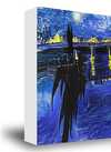
White €1
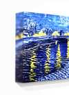
Blurside €1
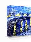
Extended €1
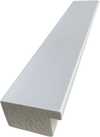
P118B €10
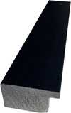
P118H €10
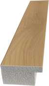
P118W €10
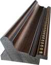
P438Z €10
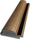
P508JH €12
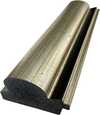
P508YH €12
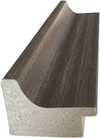
P805H €10
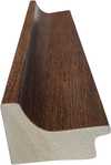
P805Z €10
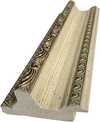
P919BZ €10
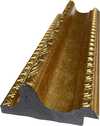
P919G €10
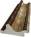
P919XJ €10
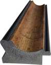
P959ZH €10
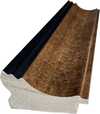
P968JZ €12
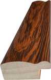
W106C €8
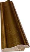
W218G €10
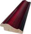
W218JH €8
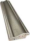
W218Y €10
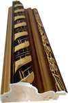
W307PJ €10
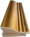
W316G €10
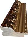
W316PJ €8
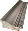
W316Y €10
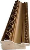
W398PJ €8
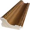
W4111J €10
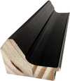
W500HY €15
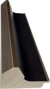
W500JH €15
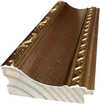
W692G €12
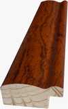
W849H €8
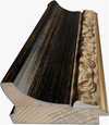
W940BG €15
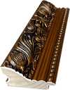
W953PJ €8
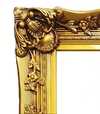
H24-GOLD €30
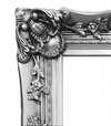
H24-SILVER €30
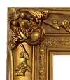
H36-GOLD €45
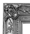
H36-SILVER €45
iii.
Make it yours
A painting made by hand can be made for one person.
After order, WikiOO.org team will email client for instructions and provide a mockup preview
iv.
Finishing
Nameplate, varnish and delivery.
Naamplaatje
Details van de gegraveerde bronzen plaat
This elegant plaque features the artist's name and the title of the artwork, finely engraved for a timeless presentation.
It is made from bronze with a refined, elegant finish. The text is precisely laser-engraved for a sharp and permanent result. Measuring 9x2 cm, the plaque is compact yet easy to read. It's built to be durable and scratch-resistant, offering a professional, museum-quality look. Mounting is simple thanks to the included adhesive backing.
Details transparante acrylplaat
The plaque includes essential engraved details such as the artist's name, the title of the artwork, the date it was created, the type of media used-like oil on canvas or watercolor-a brief description of the piece, and a QR code that links to the complete artwork information.
It is crafted from clear acrylic, offering a sleek, modern appearance. The text is UV-engraved in black to ensure strong visual contrast. With a size of 10x15 cm, it ensures optimal readability. It comes equipped with two metal hooks for secure wall mounting. The plaque is designed to be weather-resistant, making it suitable for various environments, and it includes interactive features that work seamlessly with smartphone scanning.
Details zwarte acrylplaat
This elegant plaque includes engraved information such as the artist's name, the title of the artwork, the date it was created, the type of media used (like oil on canvas or watercolor), a short description of the artwork, and a QR code for quick access to more information.
The plaque itself is made from refined black acrylic with a premium finish. The text is laser-engraved in white for high contrast and readability. Its size is 10x15 cm, designed to be easy to read. It comes with two metal hooks for professional mounting. The design is sleek and fits any interior style. It is also weather-resistant and durable, with built-in digital integration for mobile compatibility.
Beschermende vernislaag
Spoedproductie en -levering
Wereldwijde levering () binnen 3 tot 4 weken in plaats van de standaard 5 weken. (30 oktober). Zonder concessies aan de kwaliteit.
- Gratis wereldwijde expressverzending
- Hoogwaardig linnen canvas
- Volledige verzendverzekering
- Garantie op terugbetaling van invoerrechten
- Garantie op exacte kleurweergave
- Retourbeleid van 100 dagen (alleen bij defecten)
- 100% Geld-terug-garantie
- Korting bij meerdere afnames


Quick facts and art quiz
Vergelijkbare kunstwerken


