


 Podgląd w skali 1:1
 Wyślij jako kartkę
 Udostępnij
 Szczegóły dzieła
 Przewodnik

 Pobierz obraz
 Podobne obiekty
 RTG
RTG Pokaz slajdów
 Q&A
Q&A Statystyki
Look closer
Every detail, painted by hand
A vibrant explosion of color featuring Jasper Johns’ iconic alphabet painting, showcasing his unique approach to abstraction and symbolism from the 1950s. Discover this captivating artwork and bring a touch of Johns' genius into your space.
i.
The heart of the scene.
ii.
Light and background.
iii.
The brushwork.
The painting
Jasper Johns’ ‘Colored Alphabet’: A Play of Symbols and Perception
Jasper Johns' "Colored Alphabet," created around 1959, stands as a deceptively simple yet profoundly complex work within the artist’s evolving body of exploration. This painting isn’t merely an arrangement of letters; it’s a meticulously crafted meditation on perception, representation, and the very nature of meaning itself – themes central to Johns' groundbreaking approach to art in the mid-20th century. The piece immediately draws the eye with its vibrant palette, a deliberate departure from the monochrome often associated with Abstract Expressionism, aligning it subtly with the burgeoning Pop Art movement that would soon challenge traditional artistic hierarchies.
- Subject Matter: The core subject is undeniably the alphabet – 26 letters, both uppercase and lowercase, presented in isolation.
- Color as a Key Element: Each letter is rendered in a distinct color, creating a visually arresting composition that elevates the mundane to the extraordinary. This chromatic layering isn’t arbitrary; it's a calculated strategy to disrupt conventional reading and viewing habits.
- Abstract Arrangement: The letters are arranged without any discernible order or pattern, further emphasizing their symbolic weight rather than their functional purpose.
The Roots of Iconography in Johns’ Work
Understanding the context surrounding “Colored Alphabet” is crucial to appreciating its significance. Johns emerged during a period of intense artistic experimentation following World War II. The Abstract Expressionists, with their emphasis on raw emotion and gestural abstraction, had dominated the art scene, but Johns sought to move beyond purely subjective expression. He began to incorporate recognizable imagery – maps, flags, numbers, and, crucially, letters – into his work, transforming them into symbols that carried layers of cultural and personal meaning. This fascination with iconography reflects a broader postwar anxiety about identity, national narratives, and the increasingly mediated nature of reality.
As documented in The Art Institute of Chicago’s collection, Johns utilized stencils as a key component of his process, adding another layer of complexity to the work. This technique is evident in "Colored Alphabet," where the precise execution of each letter suggests a deliberate engagement with the tools and methods of mass production – a subtle commentary on the role of images in contemporary society.
Technique and Materiality
The painting’s surface reveals Johns' meticulous attention to detail. The letters are rendered with a smooth, almost enamel-like finish, achieved through careful layering of paint. This technique creates a tactile quality that invites close examination, encouraging the viewer to consider not just what they see but also how it was made. The use of bright, saturated colors further enhances this sense of materiality, emphasizing the physicality of the artwork and challenging the traditional notion of painting as purely an illusionistic medium.
Symbolic Resonance and Emotional Impact
"Colored Alphabet" transcends a simple depiction of letters; it becomes a potent symbol of communication, knowledge, and perhaps even the limitations of language itself. The isolated letters disrupt our ability to read and comprehend, forcing us to confront the inherent ambiguity of representation. Johns’ work invites contemplation on how we interpret images and symbols, and how these interpretations shape our understanding of the world. It's a piece that resonates with a quiet intensity, prompting viewers to question their own perceptions and assumptions – a hallmark of Johns’ enduring artistic legacy.
Pytania i odpowiedzi
Jakie emocje budzi "Colored alphabet"?
Emocjonalny ton przypisany do „Colored alphabet” – Jasper Johns to Reflective. Oddaje on emocje, jakie wyraża to dzieło.
Jaka paleta i dominujący kolor definiują "Colored alphabet"?
Kolorystyka dzieła „Colored alphabet” – Jasper Johns: paleta Dark, w której dominuje Espresso (#35382b).
Jak nasycone są kolory w „Colored alphabet” – Jasper Johns?
Kolory w „Colored alphabet” – Jasper Johns charakteryzują się Balanced intensywnością.
Ten utwór podlega ochronie prawem autorskim
Dzieło sztuki prezentowane na tej stronie podlega ochronie prawem autorskim, co oznacza, że nie mamy prawa do tworzenia ani sprzedaży jego identycznej reprodukcji. Ochrona ta jest egzekwowana na mocy umów międzynarodowych, takich jak Konwencja berneńska oraz przez przepisy prawa krajowego, w tym te określone w Prawo autorskie USA – Tytuł 17.
Jako pełną szacunku i legalną alternatywę oferujemy personalizowane, malowane ręcznie dzieła sztuki inspirowane oryginałem. Nasi wykwalifikowani i profesjonalni artyści starannie analizują styl, nastrój oraz artystyczną esencję pierwowzoru, aby stworzyć nowe, unikalne dzieło, które przywołuje te same emocje – pozostając jednocześnie w pełni oryginalną kreacją.
Metoda ta jest w pełni zgodna z przepisami prawa autorskiego, ponieważ nie polega na kopiowaniu ani powielaniu chronionego dzieła. Stanowi ona kreatywną reinterpretację – nowy obraz, który czerpie inspirację z oryginału, ale nie jest z nim tożsamy.
 Dowiedz się więcej
Jasper Johns
1930 - , Stany Zjednoczone
The painter
Jasper Johns (1930) – pionier pop-artu i abstrakcjonizmu! Odkryj ikoniczne dzieła, takie jak 'Flaga', mapy i tarcze – redefinicję sztuki współczesnej.
Biografia artysty
A Life Painted in Symbols: The World of Jasper Johns
Jasper Johns emerged as a pivotal figure in the landscape of American art, bridging the emotive intensity of Abstract Expressionism with the burgeoning Pop Art movement that would soon redefine artistic boundaries. Born in Augusta, Georgia, in 1930, his early life was marked by a sense of displacement following his parents’ divorce, an experience that perhaps subtly informed his later explorations of identity and belonging within the context of American iconography. His formative years unfolded across various schools before he briefly attended the University of South Carolina, but it wasn't until his move to New York City in 1949 that Johns truly began to forge his artistic path. A period of service during the Korean War further shaped his perspective, exposing him to a world far removed from the burgeoning art scene he was eager to embrace upon his return.Breaking with Abstraction: The Dawn of a New Visual Language
The post-war American art world was dominated by Abstract Expressionism—a style characterized by spontaneous gesture and deeply personal emotional expression. While initially influenced by this movement, Johns felt compelled to move beyond its purely non-representational approach. He sought a new visual language, one that incorporated recognizable imagery not as illustrations but as vehicles for deeper contemplation. This wasn’t simply about *depicting* the world; it was about questioning how we perceive and interpret symbols within it. Key influences guided his departure: Marcel Duchamp's radical readymades challenged conventional notions of art-making, while the emphasis on materiality in Abstract Expressionism informed Johns’ early techniques. However, it was the everyday objects and potent symbols of American culture—flags, targets, maps, numbers—that truly became central to his artistic vocabulary. He wasn’t interested in escaping representation; he wanted to dissect it, layer it with meaning, and ultimately reveal its inherent ambiguities.Iconic Images: Flags, Targets, and the Language of Symbols
Johns' breakthrough works arrived in the mid-1950s, instantly establishing him as a force to be reckoned with. His paintings of flags, most notably *Flag* (1954–55), were not patriotic declarations but rather investigations into the very nature of representation. Rendered in a semi-abstract style, using encaustic—pigment mixed with hot wax—and collage techniques, these flags weren’t simply images; they were textured surfaces laden with symbolic weight. The *Flag* series wasn't about celebrating American nationalism, but rather exploring themes of perception, memory, and the relationship between image and reality. The target series, beginning in 1958, further explored this fascination with recognizable forms, questioning perception and meaning through the seemingly straightforward image of a bullseye. *Map* (1961), with its fragmented and layered depictions of the United States, delved into themes of geography, identity, and the complexities of national representation. Works like *False Start* (1959) demonstrated his experimentation with language and visual codes, creating complex compositions that challenged viewers to decipher their underlying meanings. Even *White Flag* (1955), a seemingly simple monochrome canvas, prompted profound questions about absence, surrender, and the very act of seeing.Influences and Techniques
Johns’ artistic development was shaped by a diverse range of influences. The work of Marcel Duchamp profoundly impacted his thinking about representation, encouraging him to question the traditional boundaries between art and reality. The emphasis on materiality in Abstract Expressionism—particularly the use of texture and surface—provided a foundation for his later techniques. He experimented with various media, including encaustic, collage, lithography, and woodcut, often combining them in innovative ways. His meticulous attention to detail and his willingness to incorporate found objects into his work reflected a deep engagement with the physical world. The influence of Robert Rauschenberg, with whom he collaborated closely during the early 1950s, was also significant, fostering a spirit of experimentation and pushing the boundaries of artistic practice.Recognition and Enduring Impact
Jasper Johns has received numerous accolades throughout his illustrious career. He was awarded the Golden Lion at the Venice Biennale in 1988, the National Medal of Arts in 1990, and the Presidential Medal of Freedom in 2011 – a testament to his profound impact on American art. His works are held in major museum collections across the globe—the Museum of Modern Art, the Whitney Museum of American Art, the Metropolitan Museum of Art in New York, and Tate Modern in London, to name just a few. Beyond his paintings, Johns’ contributions extend to sculpture and printmaking, demonstrating his versatility and unwavering commitment to artistic innovation. His enduring legacy lies not only in the iconic images he created but also in the profound questions he raised about the nature of representation, symbolism, and the very essence of what it means to be an artist in a rapidly changing world. He remains an active artist, constantly evolving his approach and solidifying his position as one of the most important figures in 20th and 21st-century art.Quick facts about Jasper Johns
- Artistic Movement Or Style: Pop Art, Abstrakcjonizm
- Artists Or Movements Influenced By This Artist:
- Andy Warhol
- Roy Lichtenstein
- Artists Who Influenced This Artist: ['Marcel Duchamp']
- Date Of Birth: 15 maja 1930
- Full Name: Jasper Johns
- Nationality: Amerykański
- Notable Artworks:
- Flag
- Target
- Mapa
- Place Of Birth: Augusta, USA


Ręcznie malowana reprodukcja olejowa
Have it painted for you
Ręcznie malowana reprodukcja olejowa
Ręcznie malowany obraz olejny na płótnie, wykonany na zamówienie przez naszych artystów w wybranym przez Ciebie wymiarze i oprawie. ( Przełącz na wydania drukowane Przejdź do wersji cyfrowej)

Your commission

Colored alphabet
Technika reprodukcji
Wymiary reprodukcji
-

Wybitny mistrz artystyczny
Większa szczegółowość, finezja i dodatkowy czas na realizację
-

Opcje oprawy reprodukcji
-
-
W przypadku dzieł sztuki lub reprodukcji, których którykolwiek z boków przekracza 105 cm (około 41 cali), rama zostanie wysłana w formie zestawu do samodzielnego montażu. Metoda ta zapewnia bezpieczną dostawę i zapobiega uszkodzeniom podczas transportu.
Wymagany profesjonalny montaż – nie jest to produkt typu DIY.
Zestaw musi zostać złożony, a płótno naciągnięte przez doświadczonego profesjonalnego ramiarza, przy użyciu kleju do drewna (brak w zestawie), kleszczy do naciągania płótna oraz ścisków, które utrzymają krosna w równej pozycji podczas schnięcia kleju. Nieprawidłowy montaż lub nierównomierne napięcie płótna może trwale uszkodzić dzieło sztuki i nie podlega naszej gwarancji.
 W przypadku dzieł sztuki lub reprodukcji, których którykolwiek z boków przekracza 105 cm (około 41 cali), rama zostanie wysłana w formie zestawu do samodzielnego montażu. Metoda ta zapewnia bezpieczną dostawę i zapobiega uszkodzeniom podczas transportu.
W zestawie znajdują się wszystkie listwy z litego drewna, precyzyjnie docięte do wymiarów.
Montaż odbywa się przy użyciu dołączonych wkrętów oraz kleju do drewna do łączenia narożników, którego zestaw nie zawiera i który musi zostać dostarczony przez ramiarza.
Wymagane są profesjonalne narzędzia, których nie ma w zestawie: kleszcze do naciągania płótna (napinacz) oraz zaciski, które pozwolą utrzymać listwy w równej pozycji podczas schnięcia kleju.
Ważne:
Do połączenia narożników niezbędny jest klej do drewna, listwy należy unieruchomić za pomocą ścisków do momentu całkowitego wyschnięcia kleju, a naciągnięcie płótna na złożoną ramę wymaga użycia kleszczy do naciągania płótna. Żaden z tych elementów nie jest dołączony do zestawu. Przed zamówieniem tego rozmiaru zalecamy konsultację z doświadczonym ramiarzem.

Etykieta obiektu
-
-

Lakier ochronny
Lakier z połyskiem (pogłębia kolory, chroni przed światłem i wilgocią)
-

Personalizacja dzieła
Przykłady możliwości personalizacji: zastąp twarz zdjęciem klienta; dodaj zwierzę domowe (np. zamień kota na psa); umieść ukrytą wiadomość w tle; zmień krajobraz lub elementy tła.
-

Ekspresowa
Dostawa na cały świat () w ciągu 3–4 tygodni zamiast standardowych 5 tygodni. (30 Październik). Bez kompromisów w kwestii jakości.
-
Przesyłka ekspresowa
Dostawa na cały świat () w ciągu 5 tygodni. (6 Listopad).
W cenie
Cena całkowita
zł 1029
Opcja ze szkłem jest dostępna wyłącznie w rozmiarach poniżej 110 cm
i.
Scale
Slide to your wall: every size keeps the proportions of the original.
Wybierz spośród naszych standardowych rozmiarów, które zachowują oryginalne proporcje dzieła sztuki.

Wpisz wymaganą szerokość i wysokość, aby obraz pasował do Twojej ramy lub ściany. Ponieważ jest to dzieło malowane ręcznie, w przypadku rozmiaru o innych proporcjach artysta może domalować nieco więcej wokół obrazu lub przyciąć jego fragmenty — wybór należy do Ciebie. Przed rozpoczęciem pracy prześlemy Ci cyfrową wizualizację do zatwierdzenia. Obraz widoczny na tej stronie nie przedstawia rzeczywistego efektu — jedynie wizualizacja oddaje realny rezultat.
ii.
Frame
The frame is drawn on the painting at its true width.
W oprawie
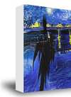
White zł1
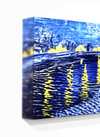
Blurside zł1
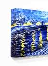
Extended zł1
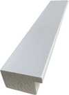
P118B zł10
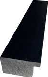
P118H zł10
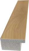
P118W zł10
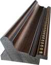
P438Z zł10
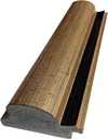
P508JH zł12
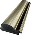
P508YH zł12
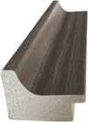
P805H zł10
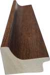
P805Z zł10
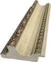
P919BZ zł10
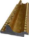
P919G zł10
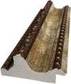
P919XJ zł10
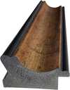
P959ZH zł10
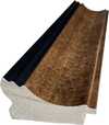
P968JZ zł12
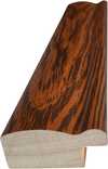
W106C zł8
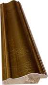
W218G zł10
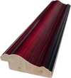
W218JH zł8
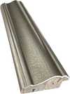
W218Y zł10
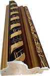
W307PJ zł10
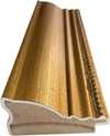
W316G zł10
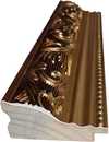
W316PJ zł8
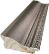
W316Y zł10
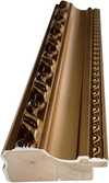
W398PJ zł8
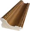
W4111J zł10
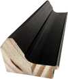
W500HY zł15
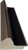
W500JH zł15
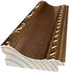
W692G zł12
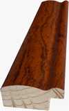
W849H zł8
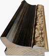
W940BG zł15
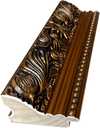
W953PJ zł8
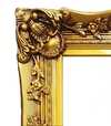
H24-GOLD zł30
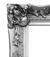
H24-SILVER zł30
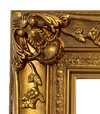
H36-GOLD zł45
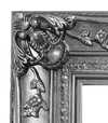
H36-SILVER zł45
iii.
Make it yours
A painting made by hand can be made for one person.
After order, WikiOO.org team will email client for instructions and provide a mockup preview
iv.
Finishing
Nameplate, varnish and delivery.
Etykieta obiektu
Szczegóły grawerowanej brązowej tabliczki
This elegant plaque features the artist's name and the title of the artwork, finely engraved for a timeless presentation.
It is made from bronze with a refined, elegant finish. The text is precisely laser-engraved for a sharp and permanent result. Measuring 9x2 cm, the plaque is compact yet easy to read. It's built to be durable and scratch-resistant, offering a professional, museum-quality look. Mounting is simple thanks to the included adhesive backing.
Szczegóły przezroczystej tabliczki akrylowej
The plaque includes essential engraved details such as the artist's name, the title of the artwork, the date it was created, the type of media used-like oil on canvas or watercolor-a brief description of the piece, and a QR code that links to the complete artwork information.
It is crafted from clear acrylic, offering a sleek, modern appearance. The text is UV-engraved in black to ensure strong visual contrast. With a size of 10x15 cm, it ensures optimal readability. It comes equipped with two metal hooks for secure wall mounting. The plaque is designed to be weather-resistant, making it suitable for various environments, and it includes interactive features that work seamlessly with smartphone scanning.
Szczegóły czarnej tabliczki akrylowej
This elegant plaque includes engraved information such as the artist's name, the title of the artwork, the date it was created, the type of media used (like oil on canvas or watercolor), a short description of the artwork, and a QR code for quick access to more information.
The plaque itself is made from refined black acrylic with a premium finish. The text is laser-engraved in white for high contrast and readability. Its size is 10x15 cm, designed to be easy to read. It comes with two metal hooks for professional mounting. The design is sleek and fits any interior style. It is also weather-resistant and durable, with built-in digital integration for mobile compatibility.
Lakier ochronny
Produkcja ekspresowa
Dostawa na całym świecie () w ciągu 3–4 tygodni zamiast standardowych 5 tygodni. (30 Październik). Bez kompromisów w kwestii jakości.
- Bezpłatna ekspresowa wysyłka na cały świat
- Wysokiej jakości płótno lniane
- Pełne ubezpieczenie przesyłki
- Gwarancja zwrotu należności celnych i podatków importowych
- Gwarancja wiernego odwzorowania kolorów
- 100-dniowa polityka zwrotów (tylko w przypadku wad)
- Gwarancja 100% zwrotu pieniędzy
- Zniżka przy zakupie wielu sztuk


Quick facts and art quiz
Powiązane artykuły

Geometria Sztuki: 10 Arcydzieł Abstrakcji Geometrycznej | WikiOO.org
Odkryj 10 arcydzieł abstrakcji geometrycznej! Poznaj historię Mondriana, Kandinskiego i Maleвича. Inspiracje wnętrzarskie z malarstwem abstrakcyjnym – reprodukcje najwyższej jakości na WikiOO.org. Eksploruj kolekcję online!

John Singer Sargent: 25 Arcydzieł Pełnych Elegancji i Światła | WikiOO.org
Odkryj 25 arcydzieł Johna Singera Sargenta – mistrza portretu i impresjonizmu. Poznaj historie, techniki i inspiracje za jego najsłynniejszymi obrazami. Reprodukcje najwyższej jakości na WikiOO.org. Eksploruj pełną kolekcję online!

John Constable: 25 Najlepszych Obrazów Mistrza Angielskiego Krajobrazu | WikiOO
Odkryj 25 arcydzieł Johna Constable'a – mistrza angielskiego krajobrazu! Poznaj romantyczne pejzaże, technikę malarską i inspiracje z Dedham Vale. Reprodukcje obrazów najwyższej jakości na WikiOO.org. Eksploruj pełną kolekcję online!

25 Arcydzieł Kandinskiego: Kolor, Duchowość i Abstrakcja w Twoim Domu | WikiOO.org
Odkryj 25 arcydzieł Wassily Kandinskiego – pioniera abstrakcji i ekspresjonizmu! Poznaj historie, techniki i emocje kryjące się za jego kolorowymi kompozycjami. Reprodukcje obrazów najwyższej jakości na WikiOO.org. Eksploruj pełną kolekcję online!
Podobne dzieła


